1
Ceramic glaze

CSS display: grid-lanes
Next card goes in the shortest column — Pinterest, not a newspaper.
Unsupported Browser
Your browser does not support display: grid-lanes. The fallback uses columns:. Try Safari 26.4+.
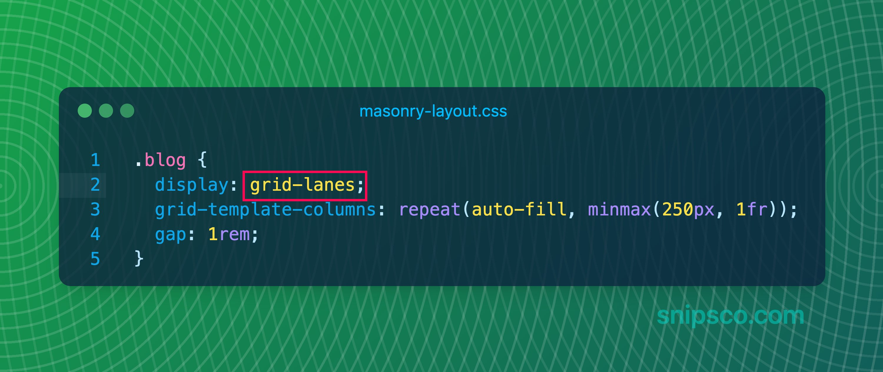
display: grid-lanes packs mixed-height items so the next one fills the shortest column — no empty row gaps. Column count still comes from grid-template-columns. The snippet above is the whole API — made in Snipsco.
columns vs grid-lanescolumns: is a newspaper: items fill down the first column, then the next. Tab order follows that. grid-lanes is Pinterest: items fill across, always into the shortest column, so tab order stays with what’s on screen.
Use grid-lanes for card and image boards. Use columns: for actual text columns, and as the fallback until grid-lanes is everywhere.
Start with columns: and break-inside: avoid on children. Inside @supports (display: grid-lanes), set columns: unset and switch to display: grid-lanes.
This browser has no grid-lanes. You’re seeing the columns: fallback. Try Safari 26.4+.
Ceramic glaze
Trail hut
Night market
Linen chair
Studio light
Coast path
Ramen bowl
Window plant
Film still
Tile sample
Desk setup
Wool throw