- Published at
Deprecated HTML tags from the early web, from marquee to framesets
A small nostalgic walk through deprecated HTML tags from the early web, from marquee to framesets.
Table of Contents
I posted Who still remembers this HTML tag? on r/webdev, and the replies had me reminiscing about the old days, we used to “design” our websites 😀.
People remembered <blink>, <center>, <font>, frames, table layouts, guestbooks, visitor counters, and those tiny “under construction” GIFs that somehow made every empty page feel official.
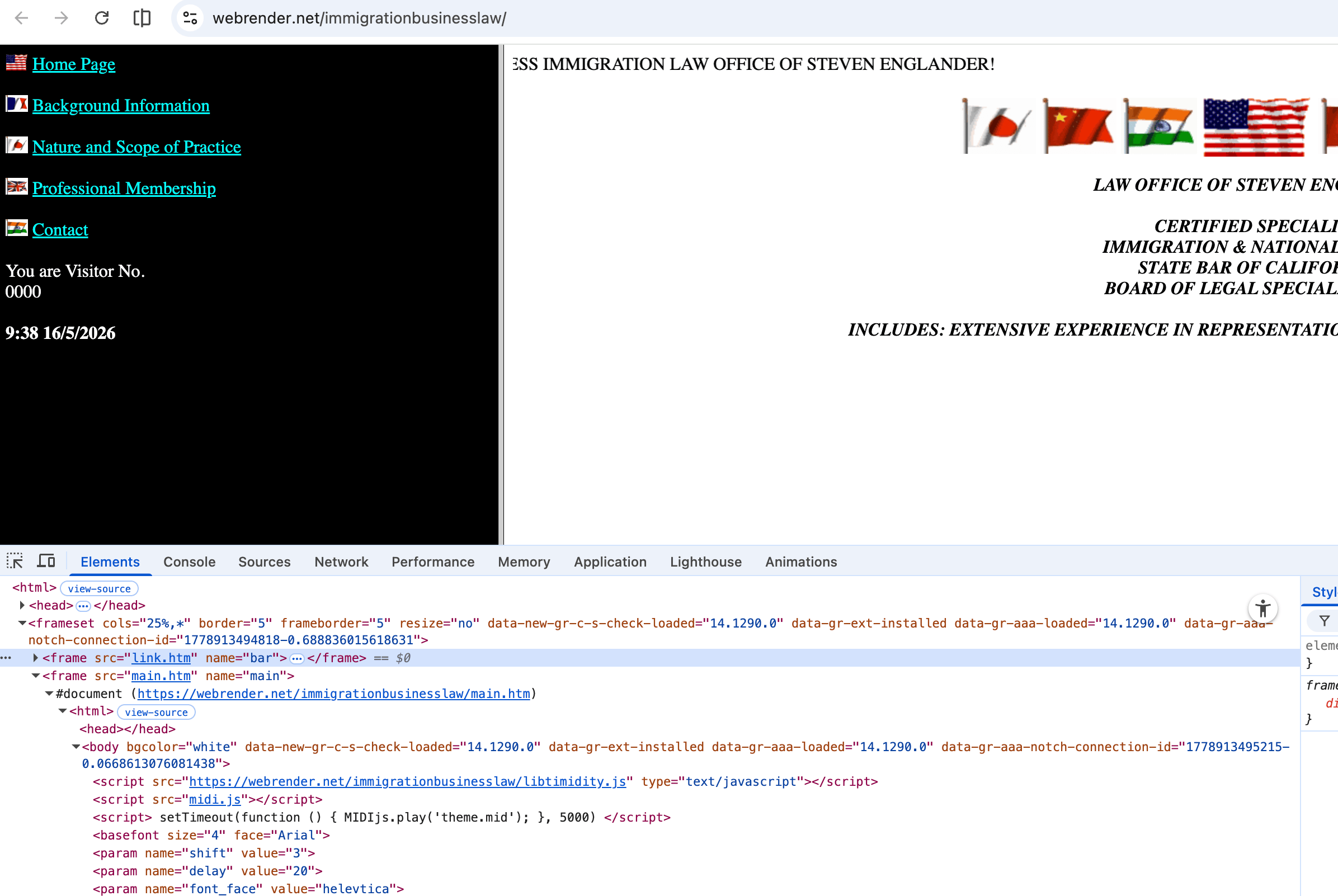
Check this out webrender.net/immigrationbusinesslaw/ and you will see what I mean.
It was messy, loud, and not always kind to readers. But it was also the web many of us learned on. We copied source, changed a color, refreshed the page, and felt like we had unlocked something.
So this is not really a strict guide to deprecated HTML.
It is more like looking through an old box of cables: some of them still work, some should stay in the box, but every one of them reminds you where you started.
And yes, I still made a little playground, because apparently I cannot see a <marquee> and just move on with my life 😅.
When text could move (animations at its best 😀)
Before I knew about CSS animations, <marquee> felt like magic. Text did not have to sit still anymore. It could slide across the page and announce that my homepage was alive.
Was it tasteful? Not really.
Did I use it anyway? Of course!
<marquee direction="left" behavior="scroll" scrollamount="6">
  ★ Welcome to my home page !!! ★
</marquee>
Play with it in the playground below:
Try marquee
Obsolete and harsh for some readers. This panel respects prefers-reduced-motion. The preview removes the old node from the DOM and inserts a new marquee on every change.
Loading preview…
The funny thing is that <marquee> still works in many browsers. It sticks around because the web tries very hard not to break old pages. That is one of the sweetest and strangest things about the platform.
But I would not use it on a real site today. CSS animations are a better way to achieve the same effect today.
Also, moving text is distracting, and for some people it can be genuinely uncomfortable.
The little chaos of <blink>
If <marquee> was movement, <blink> was pure attention-seeking.
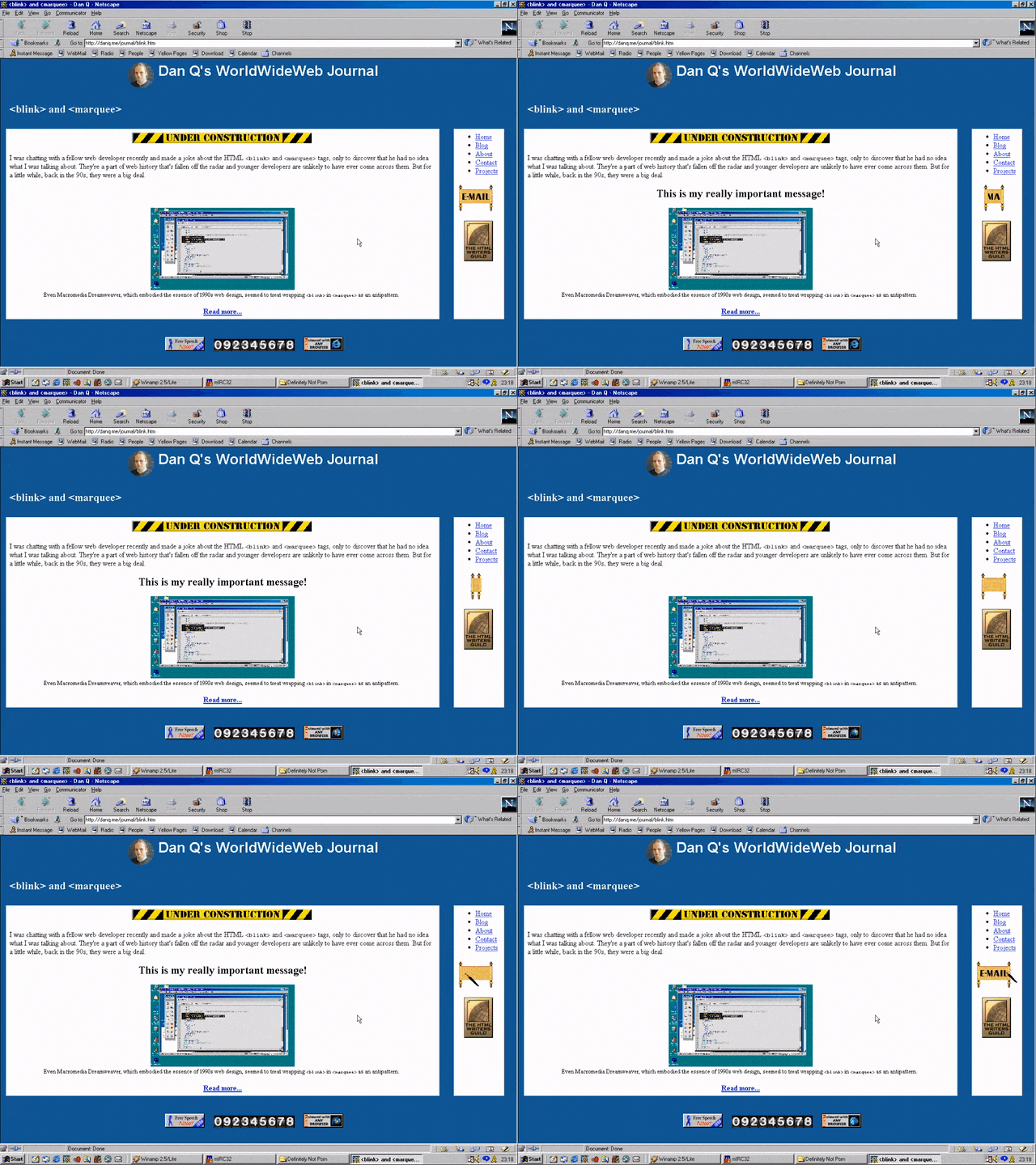
Source: danq.me/2020/11/11/blink-and-marquee/
You wrapped text in it and the browser made it . That was the whole idea.
No design review. No accessibility checklist. Just blinking text ‘yelling’ at whoever opened the page.
<p>
  <blink>PARTY LIKE IT'S 1996</blink>
</p>
I didn’t used it much, when I started to learn HTML, it was already not so popular, but <marquee> was still there.
Center everything
There was a time when <center> felt like a layout system (maybe because it was).
Want the title in the middle? Wrap it in <center>.
Want the whole page to look more “finished”? Wrap more things in <center>!
Then came <font>, and suddenly you could choose a face, a size, and a color right there in the HTML.
<center>
  <font face="Comic Sans MS" size="5" color="#ff00ff">
    Welcome 2 my page!!!
  </font>
</center>
You did not need to understand architecture. You only needed curiosity and the courage to break the page a few times.
Today we have: text-align, font-family, color, proper layout, and the design system if the project has one. But I still understand why those tags felt so good when we were starting.
Frames made pages feel bigger
Frames were another thing that felt clever at the time.
You could have a header, a menu, and a content page all living in their own files. It felt almost professional.
It felt like building a tiny application before most of us had words for that. But it was also a lot of fun!
<frameset rows="80,*">
  <frame src="header.html" />
  <frameset cols="200,*">
    <frame src="nav.html" />
    <frame src="main.html" name="content" />
  </frameset>
</frameset>
The problem was that the browser did not feel as clever as we did.
URLs got weird. Bookmarks did not always point where you expected. Sharing a page could land someone inside the wrong frame or at the wrong starting point.
Still, I remember the appeal. header.html, nav.html, main.html. A whole site split into pieces.
It was clumsy, but it was also a real attempt to organize things.
Tables before layout was comfortable
I also remember using tables for layout. Not data. Layout.
A header row, a left navigation cell, a main content cell, maybe a footer.
If you needed more control, you nested another table inside. Then another. And somehow the page held together 😅.
<table width="100%" cellpadding="8" border="0">
  <tr>
    <td colspan="2" bgcolor="#000080"><font color="#ffffff">~~ My Site ~~</font></td>
  </tr>
  <tr>
    <td width="160" valign="top">Links…</td>
    <td valign="top">Main content here (and a nested table if you were brave)</td>
  </tr>
</table>
It was not semantic, and it was not fun to maintain.
But if you were learning from tutorials and View Source, it made sense. You could see rows and columns. You could imagine the page as a spreadsheet and push things into place.
Now we have flexbox and grid, and better ways to describe the structure of a page.
Tables can go back to being tables. Still, so useful for email layouts, there’s nothing better than multiple nested tables for email templates.
Bold, italic, and learning meaning later
For a long time, I thought <b> and <i> were simply the old bad tags, and <strong> and <em> were the new good ones.
The real story is softer than that!
They are not all the same, and they are not all deprecated.
Some describe meaning. Some describe a different kind of text. The important part is knowing why the text is different.
<p>
  <strong>Warning:</strong> this is important to the sentence meaning.
  <b>BrandName</b> might be bold for style, not louder emphasis.
</p>
<p>
  <em>This</em> is stressed wording; <i>Homo sapiens</i> might be italic for a Latin name.
</p>
That was one of the bigger lessons of growing up with HTML: at first I only cared how the page looked. Later I started caring what the markup meant.
The rest of the old web (the web of the 90s)
The tags were only part of it.
The old web had a whole texture that is hard to explain if you did not live in it. But I will try to explain it in a few words:
- “Best viewed in Netscape” badges.
- Under construction GIFs.
- Guestbooks.
- Visitor counters.
- Web rings.
- Tiny animated email icons.
- Background music you did not ask for.
- JavaScript image rollovers.
- Flash intros with a “Skip” link that everyone clicked.
It was personal in a way that many sites are not anymore. Pages looked like someone made them at a desk after school, late at night, or during a weekend when they were supposed to be doing something else.
Not everything was better, it was a different kind of better.
A lot of it was inaccessible, slow, broken, or just painful to read. But it had a sense of discovery. You could right-click, view source, copy a weird trick, and suddenly your own page had a little more life.
How about you? What do you remember from the early web?